fINEQUITY
Financial education for formerly incarcerated individuals.
The Problem Area
Over 19,000 people in NY’s prison system are serving at least a ten-year sentence. A person who hasn’t used credit in the past seven years has invisible or stale credit.
If an individual is barred from leasing an apartment, opening a bank account, or getting a phone plan, they have difficulty integrating into society.
Client Objective
- Build a platform that facilitates credit education.
- Find a solution to help energize previously incarcerated people to engage in credit building.
The Scope
fINEQUITY had no online curriculum prior to our team’s involvement. Their product was an offline service that involved testing, education and credit building.
Proposed Challenge
- Discover how formerly incarcerated individuals perceive credit.
- Design an educational platform for credit building that considers the unique needs of its users.
- Write engaging and user-centric microcopy that motivates users to engage in credit education.
The Team
- 3 x UX Designers
- 1 x UX Writer/Content Strategist (me)
The User Research
Interviews
6 interviews gave us over 100 data points relating to credit building and financial education.
The Problem
The data points, using Miro, were organized into categories to identify trends and inform the problem.
The Persona
The data and its synthesis informed the goals, pain points, and behaviors of a “typical” user.
Advocating for UX Writing in the Interview Process

- Record interviews to understand the language potential users use around credit and financial decision making.
- Ensure there are questions regarding users online habits and technical literacy.
- Ask questions that determine users relationship with education.
The interviews provided us with a mountain of data points which we grouped based on specific needs, problems or goals.

Synthesis
The data points informed the insights and problem statement. The synthesis was challenging due to the individual experiences of each user. I created a synthesis document to ensure our team and the stakeholders could see the design thinking that went into the solution.

The User Persona
We assembled the I-statements and insights into a User Persona. This personified the problem and ensured the User, Damian, was the motivator for all aspects of the Design.
Meet Damian

Behaviors
- Driven by tangible goals-a phone, car, apartment.
- Knows credit is important, but it’s not Damian’s top priority.
- Has difficulty ready beyond a 4th grade level.
Pain Points
- Doesn’t know where to start to build my credit.
- Banks and stores reject him due to “bad” credit.
- Feels like he has little control over his life.
“I want to walk into a bank or stores and not have to worry about credit.“
“Now that I have the chance, I’m going to build a better life for myself and kids.”
“I planning on moving out of my parents and getting an apartment this year.”
The Brand Research
The Brand Persona/Personality
Through conversations with fINEQUITY’S marketing team and examination of their existing product and values, a brand persona was created. Just as a user persona helps us not forget who we are designing for, a brand persona ensures consistency of voice and tone throughout the product.
Meet Eve

Definitely Not
Fake, gloomy, arrogant, strict or whimsical
Definitely Does
- Talks in first person as “we.”
- Direct address the user with “you, your, you’re.”
Values
- Empower
- Teach
- Accessible
- Goal-Centric
Personality
- Helpful and friendly.
- Has a simple and warm sense of humor.
- Open to accepting and accommodating all.
- Will extend themselves to help others.
“I’m not here to tell you what to do, I’m here to show you.”
“People learn best through stories that they can relate to. “
“Learning is better when you set goals.“
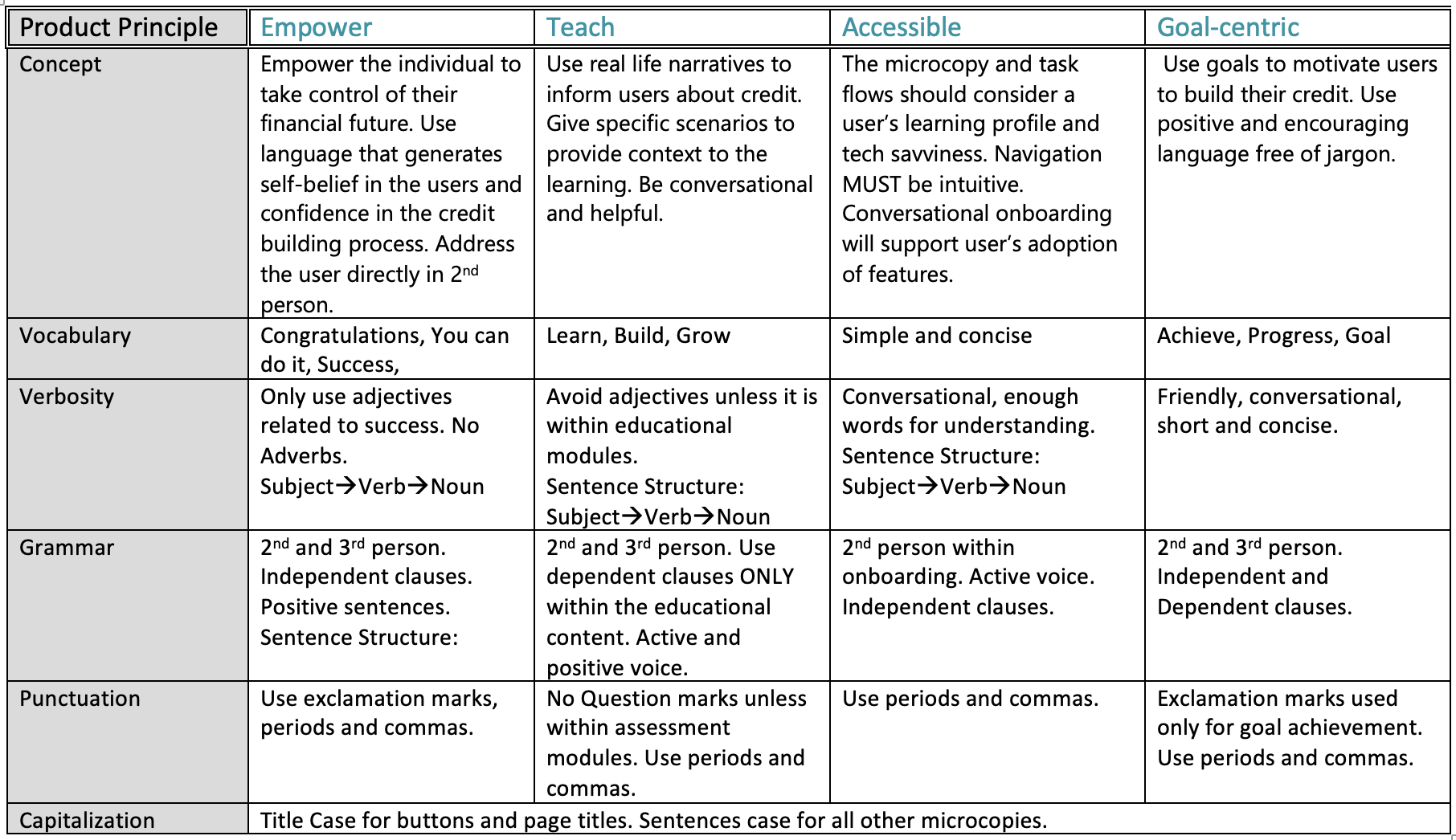
Voice and Tone
To help standardize language and voice, I created a voice chart. This was used by the team to ensure that the designs and microcopy adhered to brand values and considered the user’s unique learning profiles. Clear and concise vocabulary, verbiage and grammar were a focus due to the varied reading levels of users.
The Solution
The Design

The Testing

The Design
The UX design process was a marriage of business and user needs. As we progressed into sketching and mid-fi wireframes, it was clear that the company’s vision and our research based sketches were not completely aligned.

The Major UX Writing Constraint
3 our of 5 people in US prisons can’t read.
Understanding the users educational level and how that impacted the prevalence and complexity of writing was a major consideration throughout every step of the design process. When heading into usability testing, I ensured that users felt comfortable voicing concerns with language. I advocated for visuals to accompany any moment of text longer than one sentence.
Mid Fidelity Usability Testing
The Objective
5 Users were asked to complete five tasks. Users were provided with a scenario that centered around their goals.
- Task 1: Set your goals
- Task 2: Build your credit
- Task 3: Learn about credit
- Task 4: Complete credit Simulation
- Task 5: Pay your loan
The tests uncovered one Major Issue and and a number of Minor Issues.
Reports were created for each task to communicate findings to stakeholders and to make our design team accountable for recommendation implementation. Download the full reports below.

Minor Recommendations across tasks
- Increase delight throughout the educational components to enhance engagement and motivation.
- Provide onboarding for the digital wallet for both purpose and how to use it.
- Add labels to goals to minimize errors.
Mid-Sprint meeting with fINEQUITY
The Challenge: Balance the business needs and user needs.
The presentation centered around the research that went into the mid fidelity wireframes. I took the lead on presenting to ensure the presentation had strong narrative qualities that highlighted our design thinking. I presented the the preliminary research to fINEQUITY to ensure the the mid-fi designs were aligned with their business goals.
The following information conveys the outcome of the meeting in regards to three specific features-the credit builder, the calculator and the digital wallet.
FEATURE: Credit Builder
| BUSINESS NEED | USER NEED | OUTCOME |
| Questioned the workload vs benefit to user. Wanted to remove credit building from site as users can get this from other places. | User research showed that individuals want to build their credit, but don’t know where to start. They are looking for tips and tricks based on their own credit score. | Relocate Credit Building recommendations into the simulator rather than have a whole feature for it. |

FEATURE: The Calculator
| BUSINESS NEED | USER NEED | OUTCOME |
| Is this feature needed? We don’t see users wanting to use this and we don’t have the man-power to create this. | Users were ambivalent about the feature as many are yet to have any loan repayments or interest rates to calculate | Remove feature when moving into high fidelity. |
FEATURE: Digital Wallet
| BUSINESS NEED | USER NEED | OUTCOME |
| We have the resources and capacity for the digital wallet to be a credit building product and would use PLAID to link the bank account. | Users were apathetic to a digital wallet that is purely an educational tool and will not use it in its current form. We suggest the tool be linked to the user’s bank account where they are given a small “loan” that they repay monthly to build credit. | Design a digital wallet that enables loan repayment to build good financial habits and credit. |


A Tone Chart
Once the features and branding were presented to stakeholders, it was important to identify the fluctuations of tone across the features.

A Move to High Fidelity
Simple and concise microcopy and implementation of clear signifies and onboarding for all navigation elements and features was a major project moving into high fidelity.
High Fidelity UX Writing
There are key moments in a user’s journey that can and should be elevated through concise and thoughtful microcopy. Success messaging, onboarding, and empty states were a particular focus.
Success Messaging

Empty States
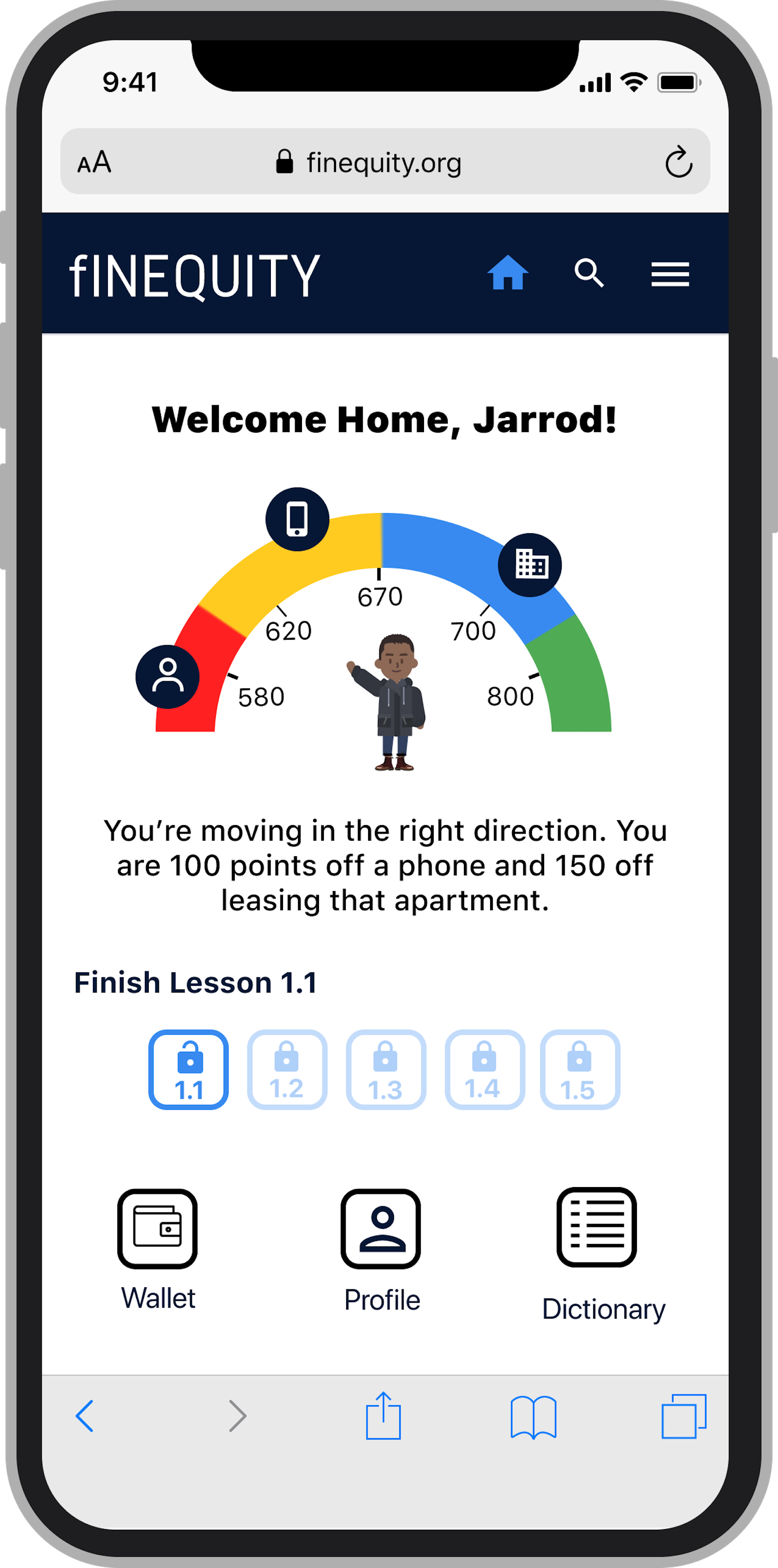
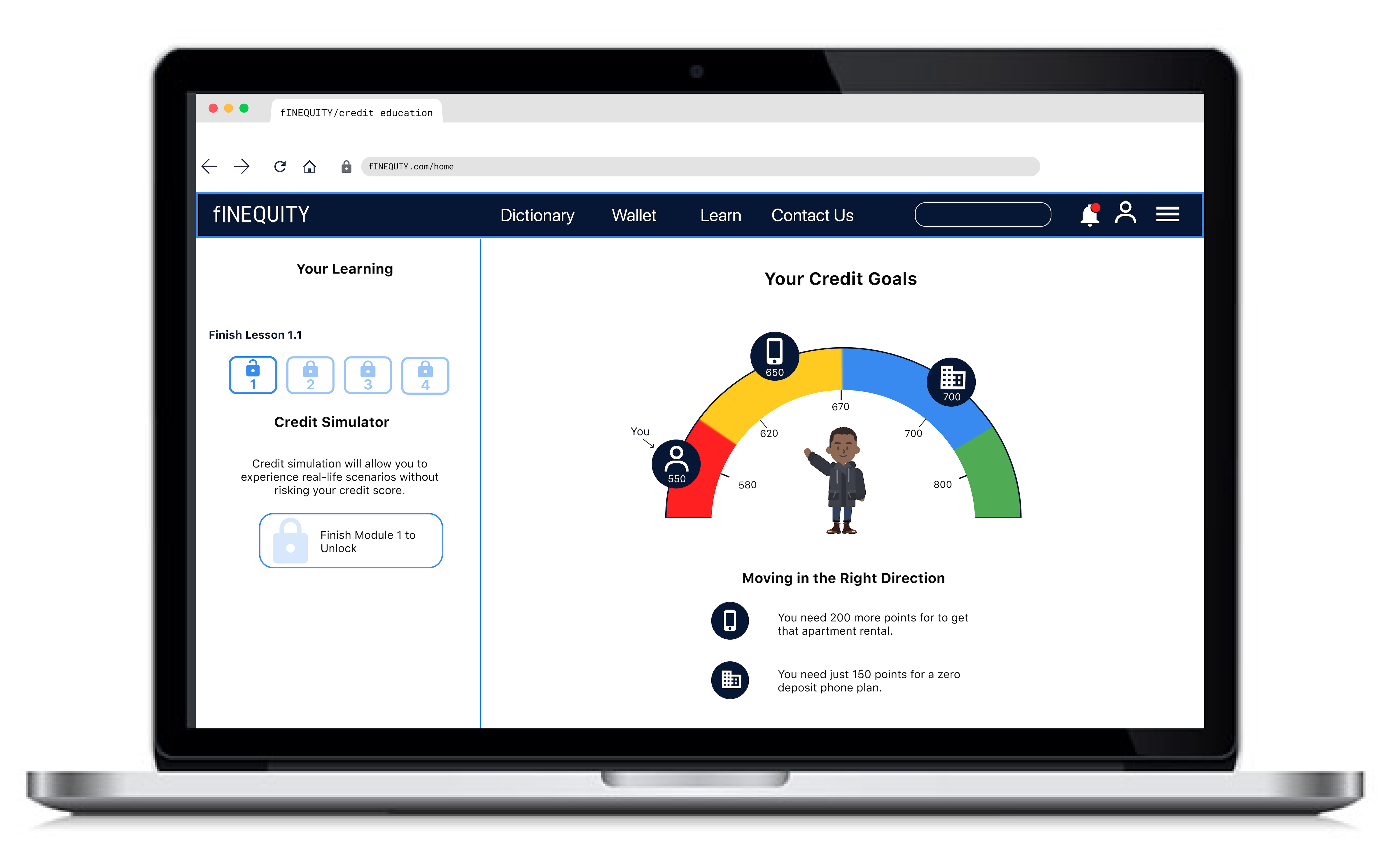
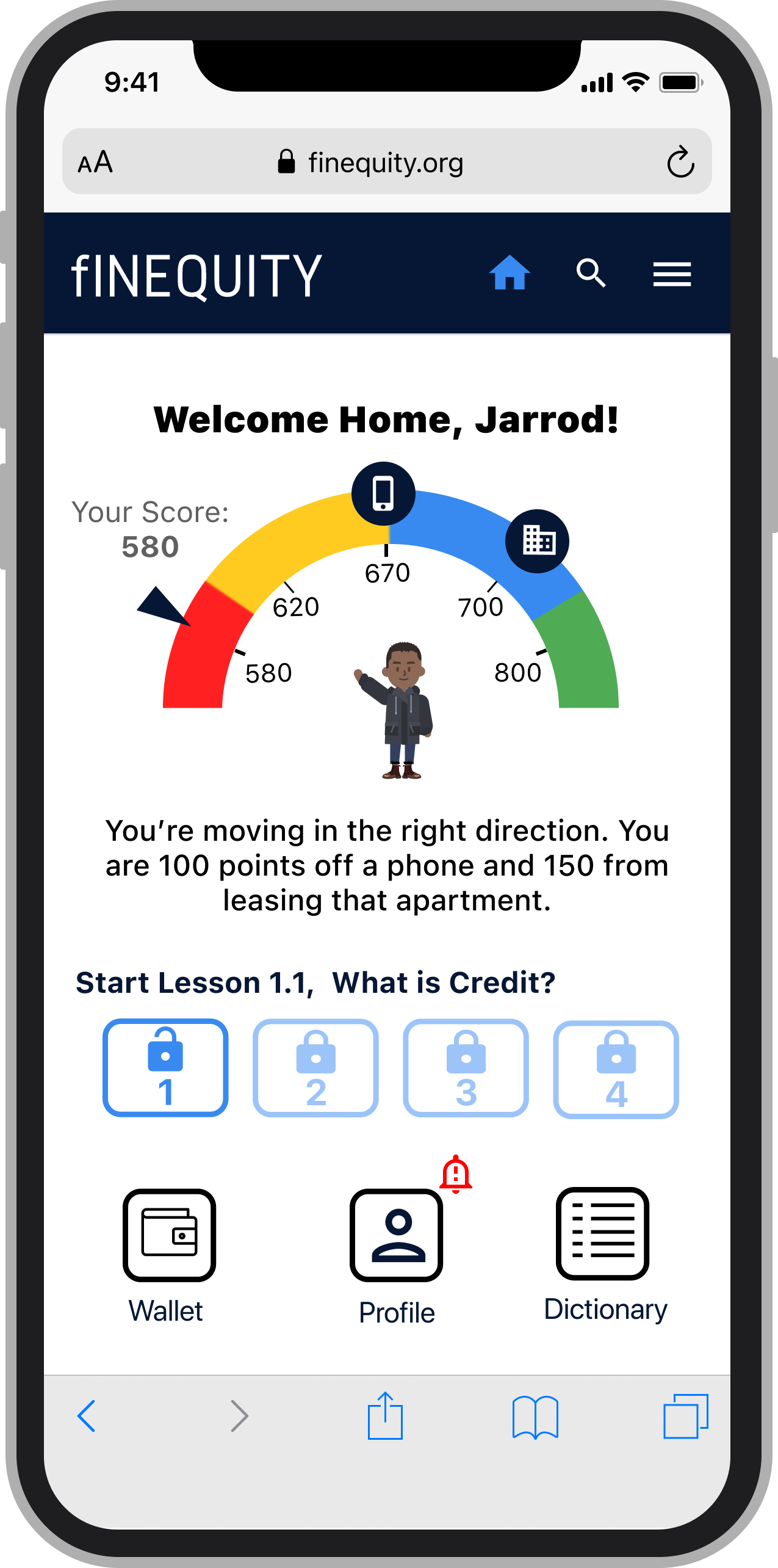
When a user does not input their credit score, an empty state is formed on the homepage. Instead of letting the user know that their credit score is missing, they are directed to input it or find out their score.
For those users who have submitted their credit score, they are provided with a diagram that enables them to track their credit in relation to their goals. Relating the credit score to user goals is key to motivating users to build their credit.
Buttons
When working in high fidelity, I went through and made sure buttons were as specific to the action as possible. By providing more information on each buttons, users felt a greater sense of control in their journey. The specificity of button copy caters to the user’s technical literacy and reading skills.

Elevate of functionality and Design and Increase Delight

I ensured that every feature under my command considered the user’s tech saviness and literacy skills. Due to my keen interest in what motivates users, I worked on the goals, the curriculum, and the home page independently and oversaw the microcopy across all frames.
- Highlight Keywords
- Bulleted lists vs paragraphs of text
- Clear page headings
- Visualize information
- Clear iconography
- Zero distractions
- Sentence structure of Subject, Noun, Verb.
Next Steps
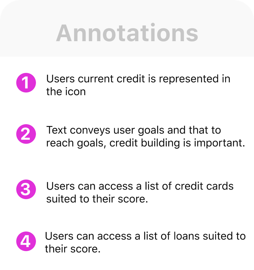
The high fidelity prototype along with annotations across 89 slides were provided to stakeholders at the handover.
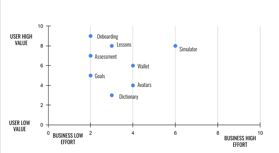
The Priority Matrix
A priority matrix was created to visualize the features and their implementation workload. It was important to provide fINEQUITY with a UX Strategy to guide the next steps once the handover was complete. The feedback from the high fidelity usability tests gave us insights on user value. Conversations with fINEQUITY’S engineers gave us insight into the workload for each feature.
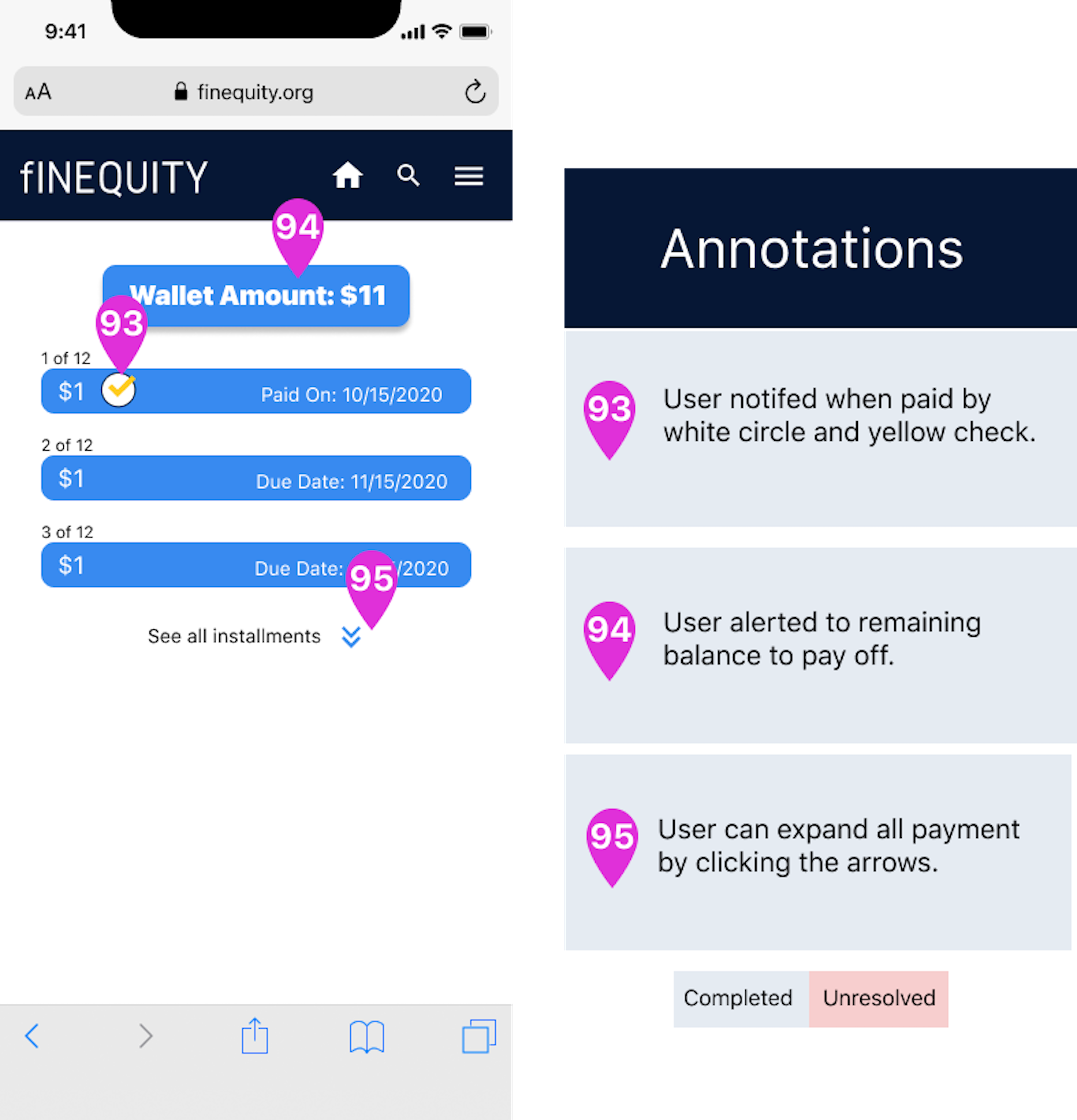
Annotations
fINEQUITY was delivered clear annotations outlining research findings and product changes. The following Next Steps are important in ensuring that fINEQUITY’s educational products meet the needs of their users. Completing the annotations was my role as it involved writing about the functionality of product elements and provided clear guidance for any changed that needed to be made.


Broad Next Steps
- Ensure every frame is responsive
- Implement changes outlined in the annotations
- Conduct usability testing on the annotated changes
- Ensure the components library is complete to make handoff more efficient.
Personal Takeaways
The most rewarding aspect of the design process was creating a user centric product that considered the users education level, goals, and pain points. Throughout usability test, users showed interest and positive surprise at the thoughtfulness of the goal-centric product. Users felt comfortable critiquing any unclear phrases, frames or flows and provided invaluable insights that were incorporated into high fidelity and the annotations.
The greatest challenge of the design process was juggling the organization’s preconceived vision for the product with what the research told us users needed. The research told us that users are not motivated by credit scores, but are motivated by the tangible assets good credit can bring. Presenting research in a systematic way enabled us to energize stakeholders to consider inserting tangible goods (apartments, houses, shoes, cars) into all aspects of the product, in particular, the curriculum.
A moment that I continue to reflect on is the importance of getting to know users and giving them control over a product. Formerly incarcerated individuals come out of prison with limited freedoms. Getting a job, opening a bank account, and signing up for a phone plan are impeded due to no or bad credit. There was an overarching theme of lack of freedom for all of our users so we wanted to provide a product that gave them the control and power to set realistic goals that would inch them daily towards financial freedom.

You must be logged in to post a comment.